For a dutch text click here.IntroductionThe
Dutch Ministry of Finance organized an architecture competition for which a selected group of architectural offices (
unstudio,
nox, ...) and artists were invited, including myself. The goal of the competition was not to design a building, but the new 5 euro
commemorative coin with the theme 'Netherlands and Architecture'. The winner will be rewarded with a nice price, but most of all with the honor: his design will be realized and will be a legal coin within the Netherlands.
I approached the subject 'Netherlands and Architecture' from two points of view. On one hand I paid tribute to the rich Dutch architecture history and on the other hand to the contemporary quality of Dutch architecture. These form also the two sides of my coin. Traditionally the front of the coin needs to portray the queen, while the back side displays the value of the coin.
Front side
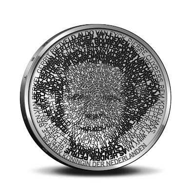
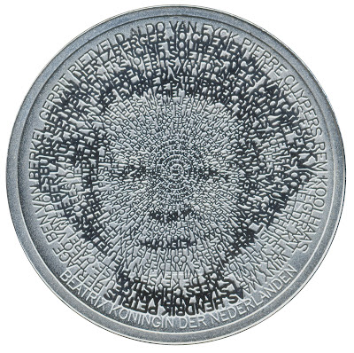
When someone looks closely (click above on picture to enlarge) to my portrait of the
queen, it becomes clear that her portrait is constructed with names of important Dutch architects. On the outside the names are clearly readable, while they slowly get smaller to the center. Under a magnifying glass all names are readable, but not with only the human eye. It is fascinating to see how an old medium like a coin can be in this way a 'compact disc' of information.
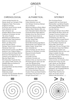
The tension between what is readable and what not, is also a metaphor how time shapes history. Some big names of the past, might be smaller names in the future and vice versa. To reflect this idea, I chose to order the architects not alphabetically or chronologically but in a new way: I used the internet as a seismograph and ordered the architects by the number of hits on the internet.

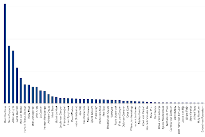
Of course this order changes over time and as such this is another time stamp on the coin besides the number '2008'. Only the first 109 architects fitted on the coin, so that was immediately the selection. Apparently becoming famous goes exponentially:

In order to achieve the image I developed my own single-line font system. I let the line width change within the same character in order to evoke an underlying picture:
 Back side
Nowadays Dutch architecture is famous for its strong conceptual approach. This translates itself in the fact that there are not only a lot of books about Dutch architects, but also by Dutch architects.

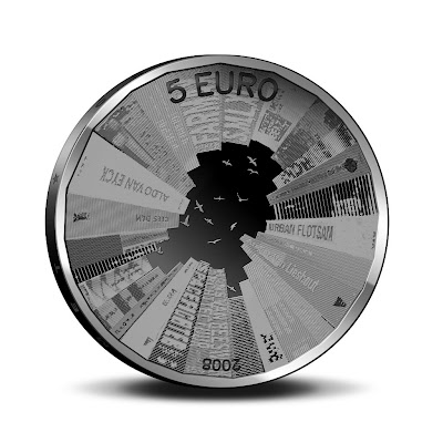
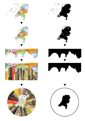
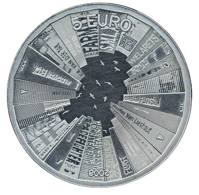
On the back side of the coin I treated the edge of the coin as a book shelve. The books rise as buildings towards the center. Through their careful placement they combine to outline the Netherlands, while birds’ silhouettes suggest the capitals of all the provinces. The following scheme reveals the process:

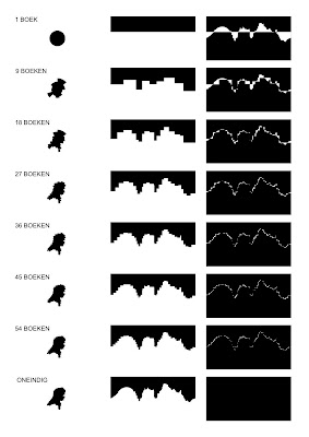
One of the issues was how many books to take: many thin books or fewer thick books. With one very thick book you would only get a circle. To get the best approximation of the Netherlands you would need books of only one page, which is not optimal either. Therefore I needed to find the optimum between these two extremes which you can see in the scheme below. On the left you see the approximation of the Netherlands, in the middle you see the 'skyline' of the books and on the right you see the difference between the 'skyline' of the books and of the border line of the Netherlands:

The following is the idea sketch for the birds. Each bird flies above the capital of each Dutch province. In the final coin these random birds are replaced with a bird which is typical for that province.
 Technology
The whole design was done for 100% with free software. The biggest part consists of custom software in
Python, of course within the
SPE editor. For the visual power I used
PIL and
pyCairo. From time to time also
Gimp,
Inkscape and
Phatch helped quite a bit. All the developing and processing was done on GNU/Linux machines which were running
Ubuntu/
Debian. In the end I had to collaborate closely on location together with the technicians of the Royal Dutch Mint (coin factory). So all the last bits were done on my
Asus Eee PC. (I am still wondering why Asus doesn't offer Ubuntu on its netbooks.) The Eee laptop took a bit longer (30 seconds instead of 3 seconds to generate a whole coin), but did the job just fine. For looking up the number of hits on the internet, I rediscovered
Yahoo, which provides a much better
api for automatic querying than its competitors. Of course the jury judged only the design and not the software used as others used Maya, Illustrator, ...
And the winner is...I am proud to announce that I
won the competition! So soon 350.000 Dutch people will use the fruits of free software. I would have loved to release the coin under the GPL, which could maybe solve the financial crisis. However for obvious reasons I was not allowed to do that. There will be also
special editions for collectors which can be bought world wide: a massive silver edition for € 30,95 and a massive gold edition for € 194,95. They will be probably sold out quickly as these are real collectors items. The coin is released in all Dutch post offices to the public the same day as the Intrepid Ibex: 30th October 2008.
Here are some scans of the real coin:


The coin will be advertised 20 times on prime time on Dutch television with a nice
video clip (will be available soon) and advertisements will run in several newspapers. Today was the official launch of the coin, with from left to right: myself, Secretary of State for Finance De Jager, the Chief government Architect Liesbeth van der Pol and Master of the Mint Maarten Brouwer...


